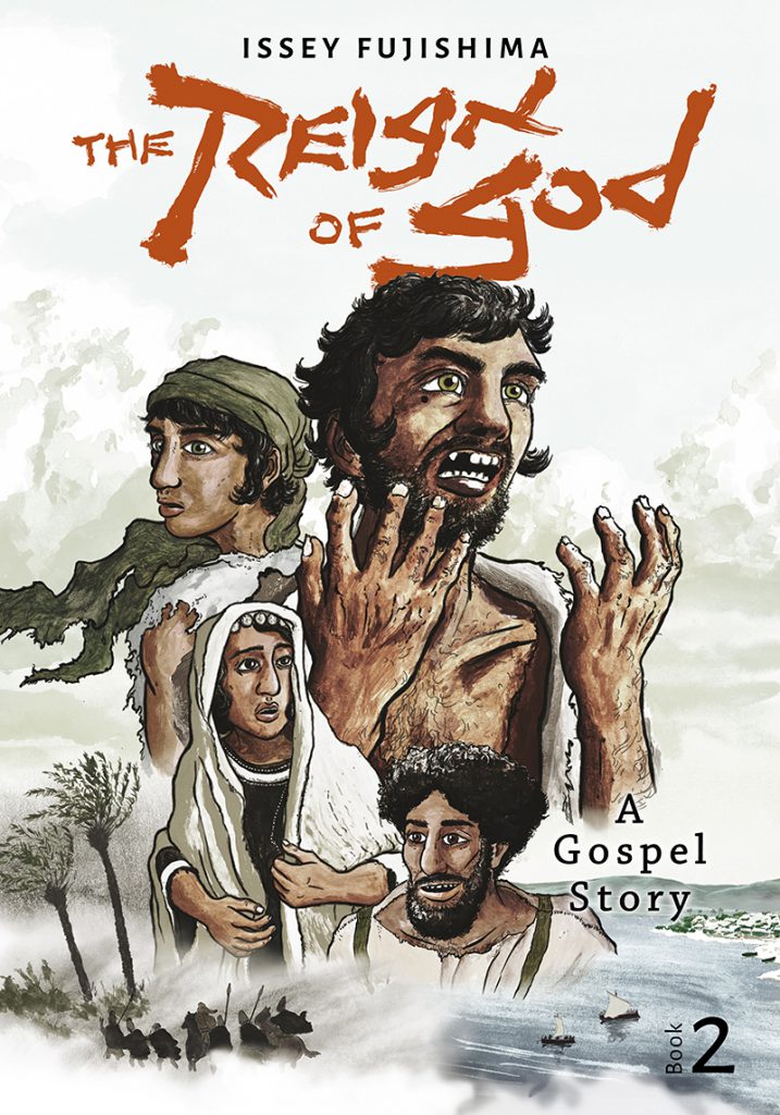
I’m pleased to present the cover art for my upcoming book. It features some of the important protagonists and the two main settings.

This time, I aimed for a more cinematic look and took inspiration from movie posters, hence the classical montage design. First time for me to do this, but I already got some positive reactions on social media on it!
We see characters from the first book: Yeshua and Shimon on the upper half, and two new characters, Leah and Simon, whom we will met in Kefar Nachum. That is, of course, the fishing town of Capernaum at the Sea of Galilee.
On the bottom: the dramatic moment as Yochanan the Immerser (John the Baptist) is led into captivity by soldiers of Prince Herod.
For this color art, I used the same technique from the first book: first I draw black outlines with ink brush pens on one sheet of regular paper, then I paint the colors with acrylic paint on sturdy art paper. Scan those two in and combine them in Photoshop. The final product results from an elaborate process of adjusting colors, contrasts, and positions. Every character and many elements such as sky, sea, and boats, are separate elements that I can shift around freely.
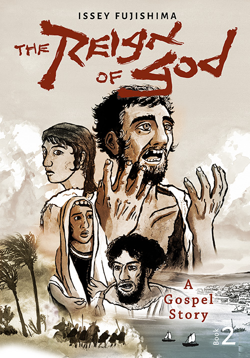
Here is a first draft for comparison:


When I made the cover for the first Reign of God book, it was exactly what I wanted to achieve, but with time, I realized it is not the most effective design. Even though it gives a sense of drama and character, it leaves many things unclear: we don’t get a sense of location and time, for example. The art for Book 2 is more straightforward about the historical setting, the focus on an ensemble character drama, and the overall atmosphere. It is a learning process. I hope I’ll find time to redesign Book 1 soon. But first, complete Book 2 for the April 3 launch!